



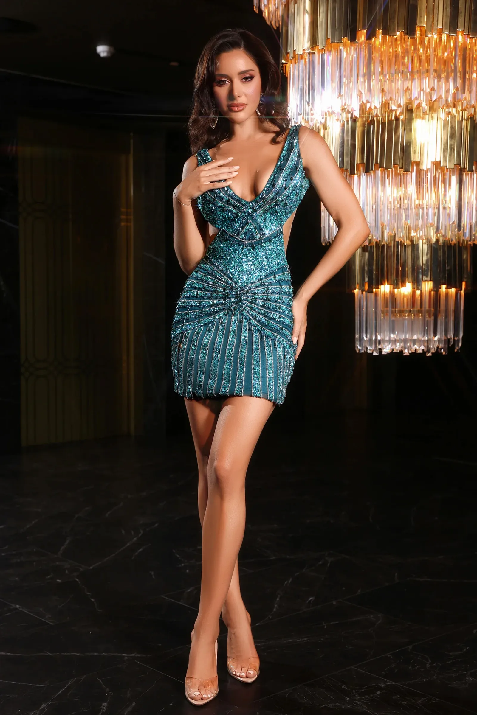
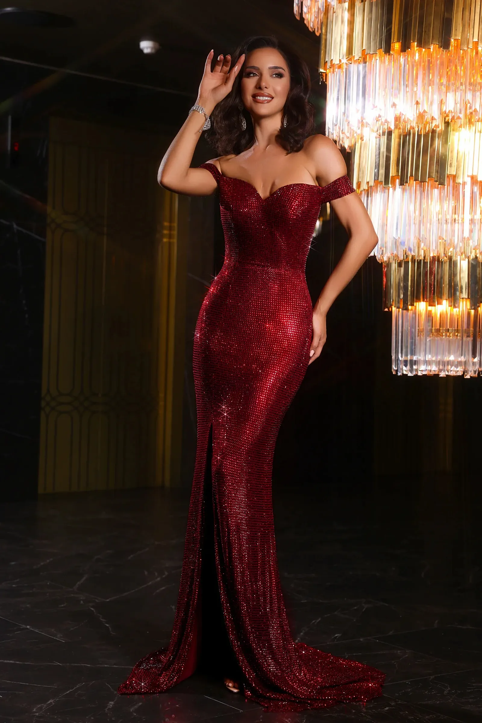
Blue is the widest color family in formalwear, and that breadth is exactly what makes it difficult to shop. A navy sheath and a baby blue tulle gown belong to the same color word but almost nothing else. This page gathers blue dresses for women across the full spectrum from near-black midnight tones through saturated jewel shades to pale, powdery pastels so you can compare undertone, depth, and finish before you narrow down to a silhouette. The guidance below explains how each family of blue behaves, who tends to wear it well, and which events each depth of shade is genuinely suited to.
The Blue Spectrum, Sorted by Depth
Most shoppers arrive with a vague idea ("something blue, not too bright") and leave frustrated because the shade names are inconsistent across brands. Grouping by depth is more useful than grouping by name.
Deep blues. Navy, midnight, and ink sit at the darkest end and function almost as neutrals. They deliver the slimming effect of black while looking softer under warm indoor lighting, which is why they dominate the evening and mother-of-the-bride markets. The navy formal dresses selection is the place to start if you want something that will still look appropriate at a conservative venue.
Saturated jewel blues. Royal, cobalt, and sapphire are pure, high-chroma shades with real visual impact. These are the blues people remember from photographs. Royal is slightly warmer and reads more classic; cobalt is sharper and cooler, with a modern edge. Compare the royal blue formal dresses range against the cobalt blue formal dresses options if you're torn side by side, the difference is obvious in a way it never is from memory.
Muted and grayed blues. Dusty blue, smokey blue, and slate carry gray in the mix, which lowers the saturation and creates a soft, romantic effect. These have become the default for outdoor weddings and daytime events precisely because they don't compete with anything. The dusty blue formal dresses group covers this territory.
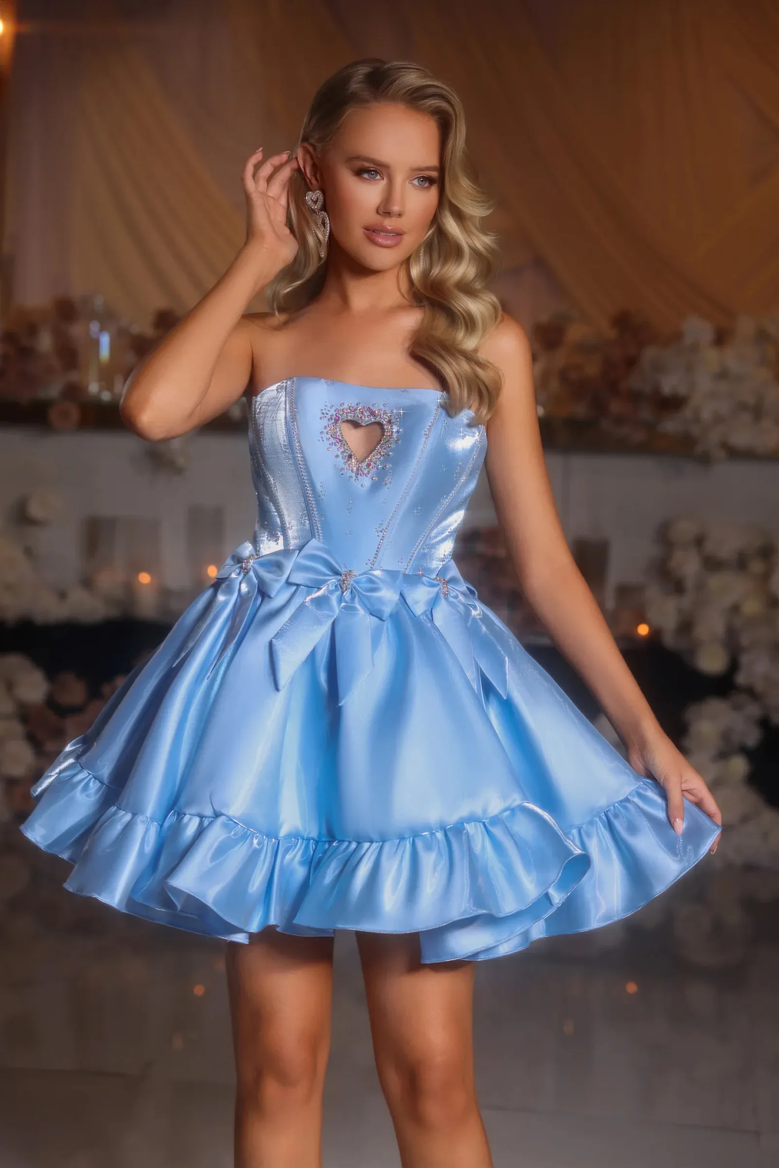
Pale blues. Powder, baby blue, sky, and periwinkle. Light and airy, strongly associated with spring and summer events, and the most flattering blues for a garden setting. See the light blue dresses selection for this end of the range.
Blue-greens. Teal, turquoise, and aqua straddle the boundary. Whether they read as blue or green depends heavily on the fabric and the light, which is worth knowing if you're matching to a color scheme someone else has set. The teal formal dresses category collects these.
Choosing a Blue That Works With Your Coloring
Skin undertone is the single most useful filter here, and it is easy to check: look at the veins on the inside of your wrist in natural daylight. Blue or purple suggests cool undertones; green suggests warm; a mix of both usually indicates neutral undertones, which is the most flexible.
Cool undertones tend to be flattered by icy, blue-leaning shades sapphire, powder blue, periwinkle because there is no warmth fighting against the skin. Warm undertones usually look better in blues that carry a hint of green or gray, such as teal, dusty blue, and denim shades, and can find the very coldest blues draining. Neutral undertones can wear nearly the whole range and should choose on depth and occasion instead.
Depth matters as much as temperature. If you have very fair skin, an extremely pale blue can wash you out unless it's broken up by beading, a contrasting belt, or a bold lip. Deeper complexions carry both ends of the spectrum well, and pale blues in particular create a striking contrast that photographs beautifully.
None of this is a rule. It is a starting point that saves you time, and if a shade makes you feel good when you try it on, that outranks any undertone chart.
How Fabric Changes the Shade
The same dye reads as several different colors depending on what it's applied to, which is the main reason blue dresses look different in person than on screen.
Matte fabrics such as crepe and chiffon absorb light and hold their true color consistently, so a navy crepe looks navy from every angle. Satin reflects heavily, creating bright highlights and dark shadow folds, which means one satin dress can appear to shift between two shades of blue as you move. That is flattering in photographs but makes precise color matching risky. Velvet reads noticeably deeper and richer than any other fabric in the same dye, so a royal blue velvet will look closer to sapphire. Tulle and organza layered over a lining lighten the perceived shade with every layer added, which is why a "royal blue" tulle skirt often looks distinctly lighter than a royal blue satin bodice on the same dress.
Embellishment complicates this further. Sequins and beads carry their own reflective color, so a blue sequin fabric usually reads brighter and more silver-toned under camera flash than it does in a dressing room mirror.
Matching the Shade to the Occasion
Weddings, as a guest. Blue is one of the safest guest colors available: it avoids the white family entirely and rarely clashes with a wedding palette. Choose depth by time of day muted and pale shades for daytime and outdoor ceremonies, deeper shades for evening receptions. The blue wedding guest dresses selection is filtered for exactly this purpose. Do check with the couple if they've set a palette, since some ask guests to avoid the bridal party's color.
Bridal party. Blue is among the most requested bridesmaid palettes, largely because it suits a wide range of complexions across a group. If you're coordinating several people, the blue bridesmaid dresses range lets you keep one shade across different silhouettes usually a better outcome than forcing everyone into one cut.
Prom and formals. This is where the saturated end earns its keep. Royal and cobalt hold up under stage lighting and photograph vividly, while navy offers a more understated option that still looks polished. Browse the blue prom dresses category for event-specific cuts.
Work and corporate events. Navy is effectively business neutral, and a structured navy dress will carry you through anything from an awards dinner to a conference.
Colors That Pair Well With Blue
Blue is unusually cooperative, but a few pairings are consistently strong.
Metallics are the easiest route. Gold and brass warm up a deep or dusty blue and create a rich, traditional contrast. Silver and platinum sharpen a cool blue and suit icy and jewel shades. Rose gold works best with the muted, grayed blues.
Neutrals are the safe choice: nude, taupe, and champagne accessories lengthen the leg line and let the dress carry the look. Black accessories with navy can look muddy under warm lighting if you want a dark accessory with navy, a deep brown or a metallic usually reads better.
For contrast, blush and dusty rose against dusty blue is a well-worn combination for good reason. Deep coral or terracotta against navy is a bolder pairing that works particularly well in autumn.
Fit and Silhouette Within a Color Category
Because this is a color page rather than a shape page, it's worth remembering that the shade decision and the silhouette decision are independent. Dark blues do provide a mild slimming effect through visual recession, but construction where the seams sit, whether the bodice is boned, how the fabric drapes over the hip matters far more than color for how a dress fits. Shoppers who want the same shade range in extended sizing can work through the blue plus size dresses selection, where the color options are grouped with fits designed for the size range rather than scaled up from a smaller pattern.
Ordering Blue Online
Blue is the hardest color family to judge on a screen, and it is worth spending an extra two minutes before you order. Phone and laptop screens vary widely in their color calibration, and blues in particular shift toward purple or teal depending on the display. Look at the product photos on more than one device if you can. Studio images shot under bright white lighting tend to be the most accurate; images shot outdoors often push blues cooler than reality.
If you are matching to a specific shade a bridal party palette, a school color, a pre-bought pair of shoes order early enough to see the dress in daylight and exchange it if the tone is off. Fabric swatches, where available, remain the only reliable way to match a color exactly.
One practical habit helps here: check the shade name in the product title against the photograph rather than assuming the two agree. Shade naming is not standardized across the industry, and one brand's "royal" can be another brand's "cobalt." The image, viewed in good light, is more reliable than the label.
Finally, consider the season. Deep and jewel blues sit naturally in autumn and winter, while pale and dusty shades belong to spring and summer, though a well-chosen navy is genuinely year-round.
Browse the full range of blue dresses at FormalDressShops to compare shades, fabrics, and finishes across every depth of blue, and to find the tone that suits your event, your coloring, and the palette you're working with.
FAQ Section
Which shade of blue is most flattering for my skin tone?
Cool undertones suit sapphire and powder blue, warm undertones suit teal and dusty blue, and neutral undertones can wear almost the full range.
Is a blue dress appropriate for a wedding guest?
Yes blue avoids the white family entirely and is one of the safest guest colors, though it's worth checking whether the couple has set a palette.
Why does my blue dress look different from the website photo?
Screen calibration and fabric finish both shift how blue reads, with satin and sequins reflecting light very differently from matte crepe.
Should I wear gold or silver jewelry with a blue dress?
Gold warms deep and dusty blues, while silver sharpens icy and jewel-toned shades like sapphire and cobalt.

Follow us


